Brand
The mark is the “oO” of LeoOi, read as two faces. The small one is a person and the large one an agent, and they are looking at each other because a card on the board is a conversation between the two.The mark


Files
- Wordmark. The name with the two faces in it. The default: use this wherever there is room for it.
- Mark. The faces on their own, square. For an avatar, an app icon, or anywhere the name is already written beside it.
- Favicon. Redrawn for 16 pixels. At that size the strokes above land on two thirds of a pixel and turn to grey smudge, so this one carries its own weights and fills more of the box. It flips to white in a dark browser chrome.
- Social image. 1200 by 630, the wordmark on our own background. What a shared link shows.

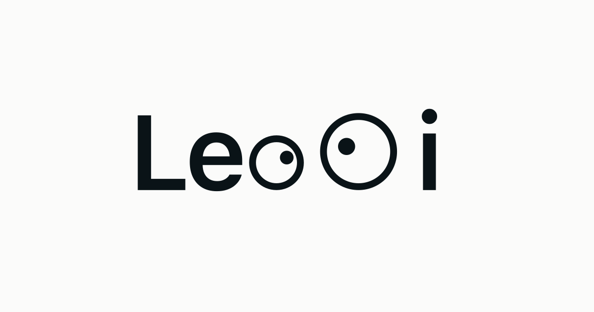
Every one of them is SVG apart from the social image, so there is no size to ask us for. If you need a raster copy at a particular width, render the SVG rather than upscaling a PNG.
Colour
| Swatch | Name | Hex | Where it goes |
|---|---|---|---|
| Ink | #0A1317 | The whole mark: both rings, both pupils, and the word. | |
| Surface | #FBFBFA | The page behind it. |
The name
LeoOi, one word, with a capital L and a capital O in the middle. Not Leooi, not LeoOI, not Leo Oi. The two Os are the joke, so the second one has to be the capital it is in the mark.
In a sentence it is a name, not a shout: LeoOi rather than LEOOI, whatever the rest of your headings do. The product is the board; the company is Devant Pte. Ltd., and the two are worth keeping apart in a credit line.
Typeface
Poppins, in regular, medium and semibold. The wordmark is Poppins semibold, and the letters in the SVG are live text rather than outlines, so a copy opened without the webfont installed falls back to whatever sans the viewer has. Outline them before print or before putting the file on another site.
Four rules
- One ink on a light surface. Reverse it to white on a dark one if you need to, and leave it there: a recoloured mark is somebody else’s logo.
- The faces are looking at each other. Mirror or rotate the mark and they are looking away, which is the one thing it was drawn not to say.
- Scale both dimensions together, from the SVG. A PNG dragged wider by a corner handle is how a stretched logo ends up in a slide deck.
- Give it room. The height of the lowercase o on every side is enough, and nothing else goes in that space.
Anything these do not cover, write to hello@leooi.com and ask.